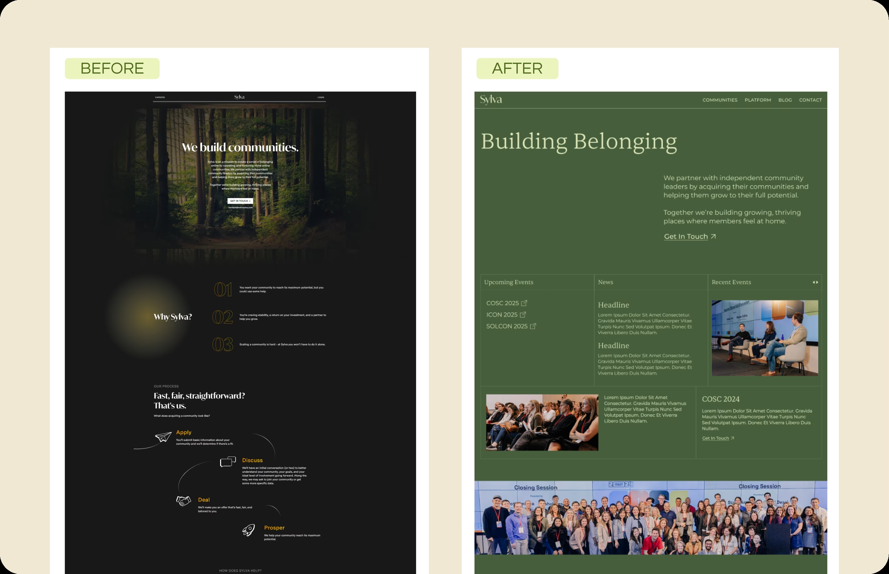
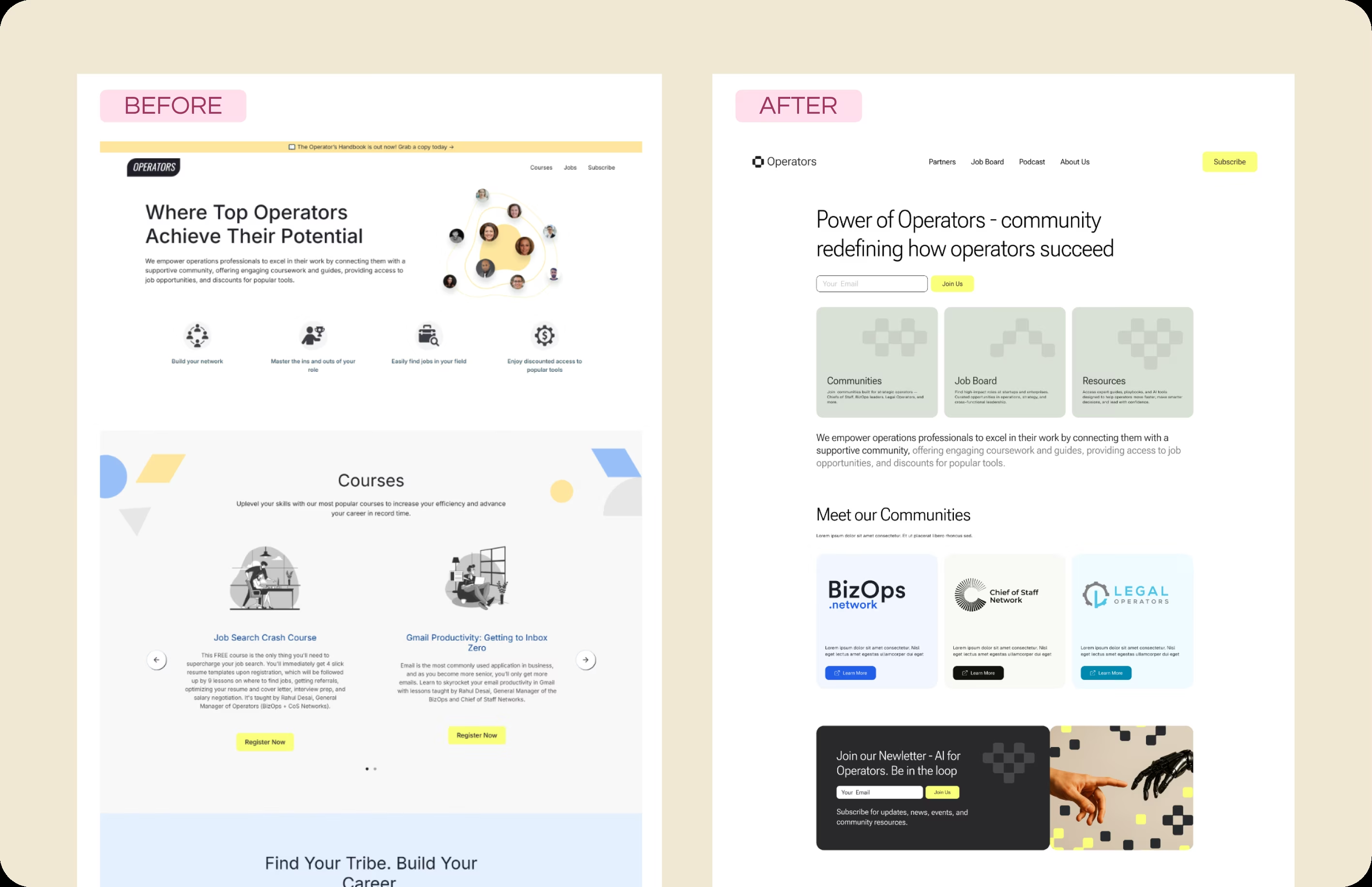
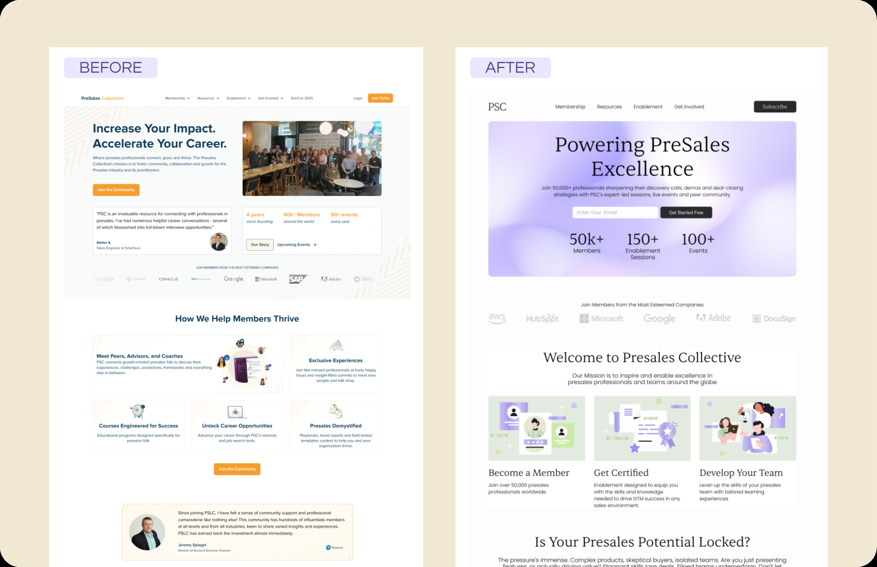
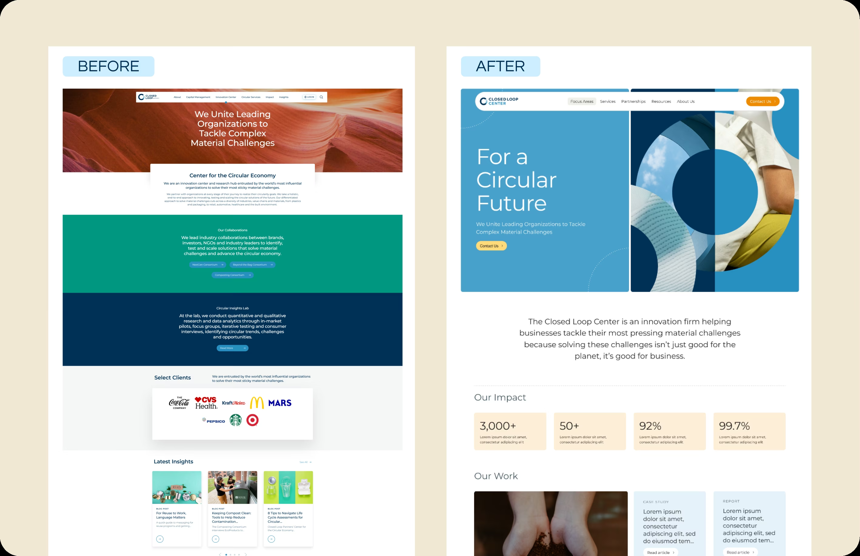
Sylva escapes dark forest aesthetic to build belonging
How we helped a community platform company escape their dark, abstract website and launch a warm, professional presence that communicates "Building Belonging" to community leaders worldwide.

A scalable platform architecture that supports multiple community brands under one cohesive roof.
From dark forest aesthetic to corporate-ready platform in under a month, without sacrificing quality.
Visitors now understand exactly what Sylva does within seconds of landing on the homepage.
The Challenge
Sylva's website was lost in the woods. Literally. Their previous site leaned too heavily on a literal interpretation of the name, featuring dark forest backgrounds that made text nearly impossible to read. The dark mode aesthetic felt gloomy rather than welcoming. Worse, the user interface lacked any clear structure, leaving visitors confused about what Sylva actually does: partnering with independent community leaders to help them grow and manage their communities. The brand felt mysterious when it needed to feel supportive and transparent.
Why Kindred
Sylva needed a partner who could see past the surface aesthetics and understand the core brand problem. They weren't just looking for a prettier website; they needed a complete visual identity shift that would resonate with community leaders and corporate partners alike. We brought our strategic design approach, starting with the question: what feeling should visitors walk away with? The answer became the foundation for everything that followed.
Implementation
We created a "Building Belonging" design system from scratch. Out went the dark forest imagery. In came a professional, grounded palette using sage greens and warm neutrals with clean, confident typography. We implemented a modular layout that clearly organizes content into events, news, and community spotlights. Most critically, we replaced the abstract stock imagery with photos of real people building real communities. Every design decision was made to humanize the brand and make visitors feel like they'd found a partner, not a vendor.
Result
The transformation was immediate. Sylva's new site is accessible, warm, and corporate-ready without feeling sterile. The information hierarchy is now logical, allowing users to quickly find event details, community news, and partnership opportunities. The visual identity shifted from "mysterious and confusing" to "transparent and supportive." Community leaders now land on the site and immediately understand how Sylva can help them grow, which is exactly what a platform company needs to scale.
What's Next
As Sylva continues to acquire and support more communities, the modular foundation we built scales with them. We designed the system to accommodate new community brands, event types, and content categories without requiring a redesign. The team now has the tools to showcase their growing portfolio of communities while maintaining the cohesive "Building Belonging" identity that ties everything together.
"We needed a site that could represent multiple community brands under one roof, and our old setup just wasn't flexible enough. Kindred delivered a platform that actually scales with us as we grow, and they moved incredibly fast to get us there."
Explore Other Topics
Ready for Your Own Transformation?
Get a free audit of your current site and see what's possible with a strategic Webflow rebuild.
Book a CallCheck Your SEO Health
See how your site performs for search engines and AI assistants with our free SEO audit tool.
Kindred SEO Pulse

