PreSales Collective elevates 50K+ community from dated funnel to premium platform
How we rebranded the world's largest presales community from a dated tech-sales funnel into a premium platform that finally matches the authority of their 50,000+ member network.
The site now reflects the scale and prestige of the world's largest presales professional community.
Complete visual identity overhaul from dated orange-blue to premium tech-forward purple glassmorphism.
Streamlined UX and elevated design now convert visitors into members at significantly improved rates.
The Challenge
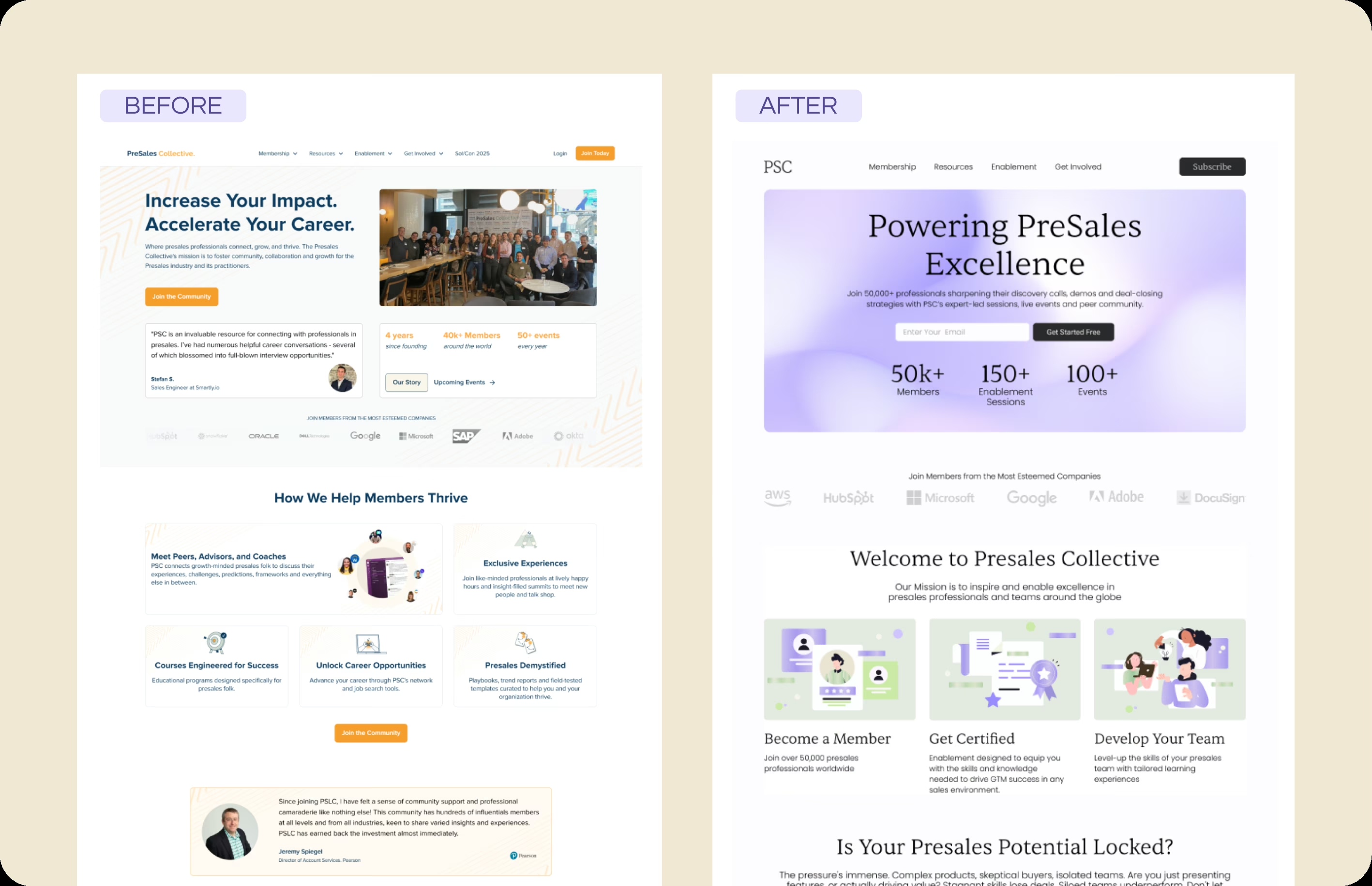
PreSales Collective had outgrown their brand. With over 50,000 members globally, they were the undisputed leader in the presales professional space. But their website told a different story. The high-contrast orange and blue color scheme felt like a generic tech sales funnel from 2015. The layout was cluttered with competing calls-to-action. Nothing about the design communicated that this was a 50K+ member community with serious educational resources and career advancement opportunities. The brand was punching below its weight.
Why Kindred
PSC needed a complete rebrand, not a refresh. They needed a partner who could look at the business, understand the audience, and create a visual system that would finally match their market position. We brought our experience working with professional communities and our eye for premium design. The goal was clear: make the website look like what PSC actually is, the market leader in presales professional development.
Implementation
We executed a complete rebrand and web build from the ground up. The dated orange-blue palette was replaced with a modern "Glassmorphism" aesthetic featuring soft purple and lavender gradients that feel premium and tech-forward. We cleaned up the social proof section, replacing cluttered testimonials with clear, scannable stats that establish authority at a glance. The value proposition was simplified into three clear pillars: Community, Education, and Careers. Every design decision was made to elevate the perceived value of membership and reduce visual noise that was distracting visitors from converting.
Result
PreSales Collective now looks like the market leader they are. The elevated design immediately communicates prestige and professionalism. The site feels like an educational ecosystem rather than a sales page, which resonates with their professional audience who are allergic to hard sells. The streamlined user experience reduces cognitive load and guides visitors through a clear journey from awareness to membership. Most importantly, the brand now has a visual identity that can scale with them as they continue to grow their dominance in the presales space.
What's Next
With the rebrand complete, PSC is positioned to expand their offerings without outgrowing their visual identity again. The design system we created is flexible enough to accommodate new course offerings, event types, job board features, and membership tiers. As they continue to grow past 50K members and into six figures, the brand foundation will grow with them, always maintaining the premium positioning that now accurately reflects who they are.
"With over 50,000 members trusting our brand, we needed a website that finally looked the part. Kindred built a site that reflects that authority perfectly. It's clean, fast, and does a much better job of converting visitors into members."
Explore Other Topics
Ready for Your Own Transformation?
Get a free audit of your current site and see what's possible with a strategic Webflow rebuild.
Book a CallCheck Your SEO Health
See how your site performs for search engines and AI assistants with our free SEO audit tool.
Kindred SEO Pulse