Operators transforms generic template into executive-grade platform
How we transformed a generic template site into a sophisticated digital home for Chief of Staff and BizOps leaders who expect nothing less than excellence.
The site now reflects the caliber of its C-suite membership, making visitors want to join before they finish scrolling.
Communities, Job Board, and Resources are now visually distinct and instantly accessible from any page.
From looking like a blog to commanding the presence of a professional institution in the operations space.
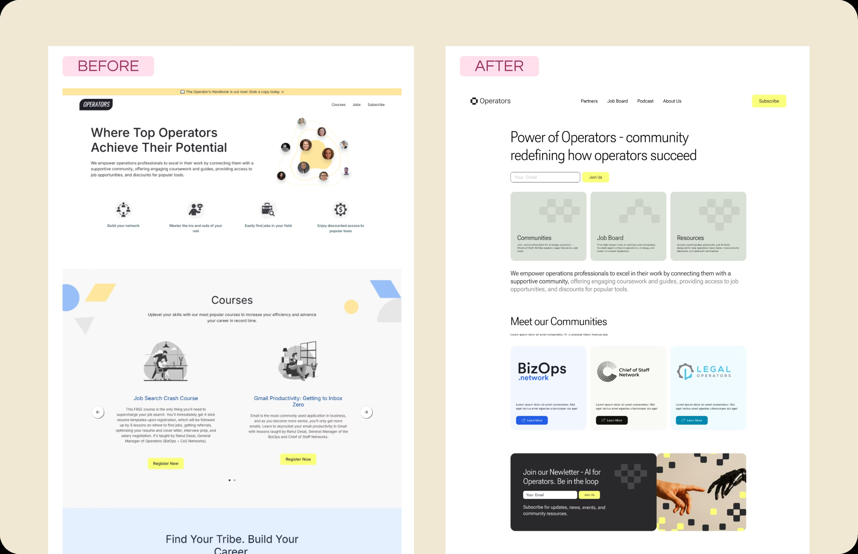
The Challenge
Operators had an identity crisis. Their community serves some of the sharpest operational minds in tech, including Chiefs of Staff, BizOps directors, and RevOps leaders at high-growth companies. But their website looked like a template anyone could spin up in an afternoon. Standard "flat" illustrations that could belong to any SaaS company. A layout that buried their distinct sub-communities in walls of text. The brand lacked any unique identity, and the cartoonish aesthetic actively worked against the professional credibility their members expected.
Why Kindred
Operators needed more than a visual refresh. They needed a partner who understood what high-level professionals expect from a community platform. We've worked with enough executive-level communities to know that these audiences make snap judgments. If the website doesn't signal quality, credibility, and exclusivity within seconds, they're gone. We brought our expertise in designing for discerning B2B audiences and our ability to translate brand values into visual systems that actually perform.
Implementation
We stripped away everything generic and rebuilt with intention. The cartoonish illustrations were replaced with a clean, minimalist card-based interface that speaks the visual language of high-level professionals. We created clear visual separation for their three core pillars: Communities, Job Board, and Resources. Each section now has its own distinct identity while maintaining cohesion across the site. The navigation was streamlined to guide users exactly where they need to go without unnecessary friction. Every pixel was designed to communicate: this is a serious community for serious operators.
Result
The transformation speaks for itself. Operators now has a digital presence that feels exclusive and high-end, matching the caliber of their membership. The "Before" looked like a blog. The "After" looks like a professional institution. The clarity of the value proposition is supported by a distraction-free layout that guides users exactly where they need to go. Most importantly, the site now pre-qualifies visitors: people who land on it understand immediately that this is a community worth joining, not just another Slack group with a landing page.
What's Next
With the foundation in place, Operators is positioned to scale their offerings. The modular design system we created accommodates new community verticals, additional job board features, and expanded resource libraries without requiring structural changes. As the operations profession continues to evolve, the Operators platform is built to evolve with it, always maintaining the premium positioning that sets them apart.
"Our community needed a home that matched the high caliber of our members. Kindred gave us a site that looks professional and immediate. It makes people want to join the network before they even finish scrolling."
Explore Other Topics
Ready for Your Own Transformation?
Get a free audit of your current site and see what's possible with a strategic Webflow rebuild.
Book a CallCheck Your SEO Health
See how your site performs for search engines and AI assistants with our free SEO audit tool.
Kindred SEO Pulse